
Redesigned Order Cards
To Boost Order Acceptance

My Role
Visual Design
Design System
Component Documentation

Team
1 Product Manager
1 UX Researcher
2 Engineers

Impact
37% SUS score increase in usability of order cards
Badges incorporated into the design system as a reusable component
OVERVIEW
How does Shipt work
Shipt is an online delivery service that connects shoppers to help customers receive groceries, household items, and more, delivered to their doorsteps.
Shipt Shopper’s journey

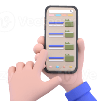
Claims an order based on pay and effort required.
Shopper shops and delivers the order

Shopper selects preferred schedule and work zone
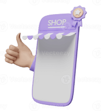
Shopper browses available orders to pickup
PROBLEM
What am I solving?
13
15
Shoppers found the order cards visually cluttered, making it difficult to focus on pay-related details.
User Problem
75%
of late deliveries are caused by shoppers dropping orders late
without reviewing information.
Business Problem
$ 380,000
is spent for every 1 million orders to deliver late dropped orders on time
Revenue Loss
Among the various causes of late deliveries,
the order claiming process is identified as a critical leverage point to
reduce late deliveries significantly.
PROBLEM
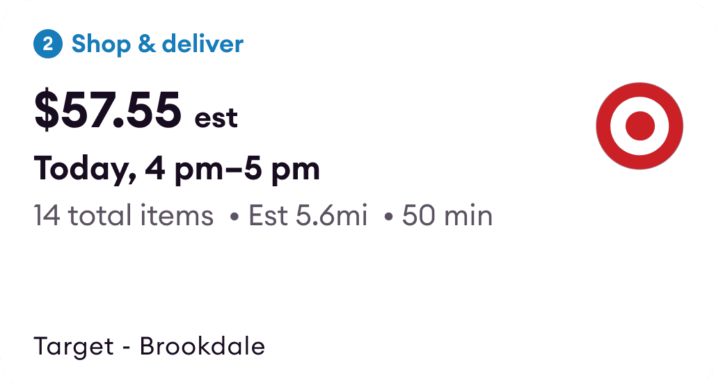
Current Order Card
Current Order Card
‘Skittle Bowl Effect’
Shoppers did not trust the est. time
from excessive badges
Pay is not prominent
Ease of claiming orders


HOW MIGHT WE
Redesign order cards to enhance clarity and support informed decision making?
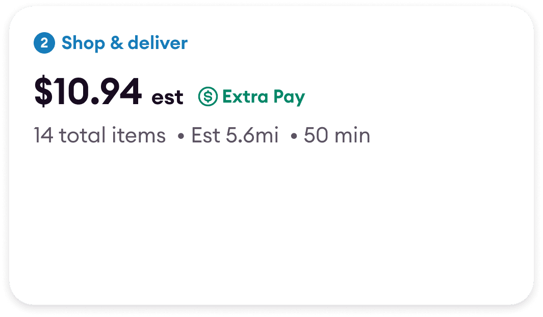
SOLUTION
Order cards simplified
Visual Clarity
Informed Decision making
The revamped order card simplifies the design by limiting the use of badges and prioritizing pay and related incentives. This reduces cognitive load, providing shoppers with the essential information they need to make informed decisions at a glance.


USER INTERVIEWS
I created user testing protocol to interview 15 shoppers
I conducted interviews with 15 shoppers at our Metro Summit and a card sorting exercise to identify the most important details shoppers need on the order card for informed decision making, enhancing its clarity and usability for a better shopping experience.
Information
Must Have
Nice to Have
Need not Have
Pay
Type of Work
Store
Miles
Incentives
No of Items
Delivery time
Zone
Drop-off
Map
45%
of shoppers agreed that Mileage is
must have that is not there on current card
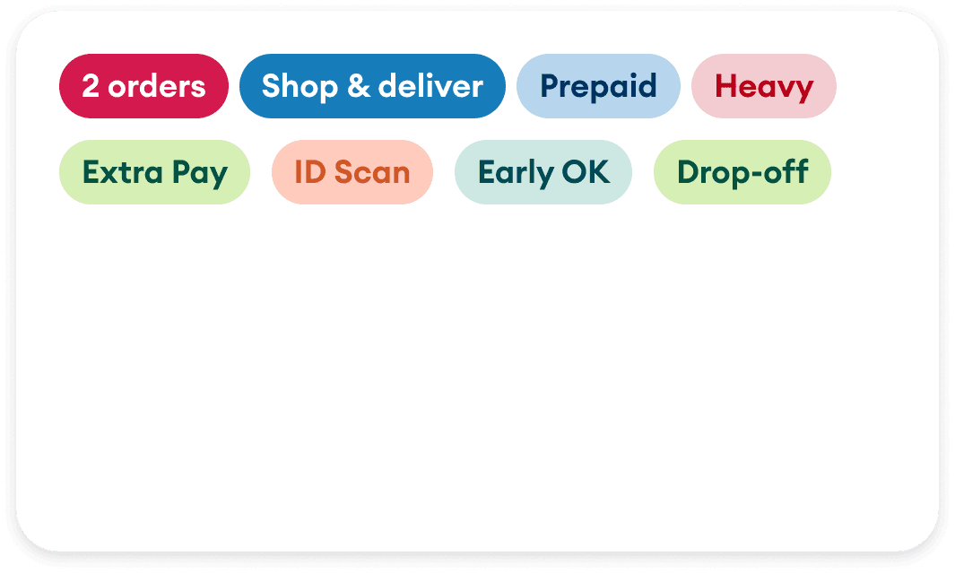
Badges
52%

shoppers agreed that Prepaid is the highest priority delivery complicator
51%


shoppers agreed that ‘ID Scan’ and ‘Heavy’ was highest priority process complicator
46%

shoppers agreed that ‘Extra pay’ was the most important incentive
REDESIGN GOALS
Reduce clutter, Retain impact
01
Visual Clarity

Simplify badges
Enhance readability at a glance
02
Information Hierarchy

Highlight pay and related incentives
Display trusted metrics
03
Scale with Ease

Room for additional information
Scalable layout
01 VISUAL CLARITY
Simplify the Badges
Through user research, I identified the most important badges shoppers need to make informed claiming decisions. From the original eight, I narrowed it down to three essential badges for the main offer card. I also established a strict guideline to limit badges, ensuring visual consistency and reducing clutter.

After
Before
Transition video is on loop
>

HAND OFF DOCUMENTATION
Design System update
Documentation
Hand-Off
I documented badge designs with detailed specifications, created state-specific variants, and successfully integrated them into the design system. This pivotal update ensured their availability in Figma working files,
ensuring consistency across.
Layout variants handoff


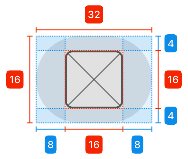
Badge
Width
Hug
Height
Hug
24px
Direction
Horizontal
Align
Center
Padding
4px
8px
Corner radius
16px
Color variants for figma


Label only
Icon leading
Icon only
Selection Colors
100/blue
900/blue
100/red
900/red
100/orange
900/orange
02 INFORMATION HIERARCHY
Highlighting Pay information
Pay
Time
Effort
Shoppers were overwhelmed by excessive information on the offer cards, making it hard to focus on key details. The revamped offer card organizes information by priority: reward (pay), time (delivery window), and effort (number of items, miles). This ensures shoppers can quickly access the details that matter most for informed decision-making.
After

Before
Transition video is on loop
>
USER FEEDBACK
A/B testing to validate at every step
Beyond evaluating the offer card at a unit level, it was essential to consider how it performed in a stacked list view. The card needed to maintain clarity and hierarchy both individually and within a list view, ensuring visual balance for efficient scanning across multiple cards.
Granular to Big Picture

“It’s like a math equation in my head”

Version 1
Key Takeaways

Pay is prominent on the individual card

Delivery window and pay is visually misaligned
Order cards when stacked, felt cluttered
Version 2

"Pay is bold and easy to spot!"
Pay is prominent on the individual card
Pay and key details remain prominent when cards are stacked
Familiar layout and alignment helped ease the transition from the old design
Key Takeaways
03 FUTURE PROSPECTS
Scale with ease
Flexibility
Usability
Effort
The design focused on balancing present needs with potential future scalability with projects such as
Target’s last mile delivery and bundle orders ensuring new features could be added without compromising usability.
Target Last Mile Delivery (TLMD)
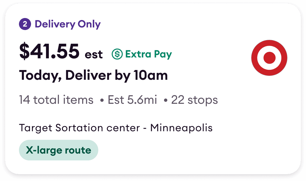
Bundle Orders


Type/Amt of work
Pay
Summary
Complicators
When
Where
WORST CASE SCENARIO
Solving for Edge case
IMPACT METRICS
37% improvement in usability
USER CENTRIC IMPACT
SUS score to measure usability
63
Old Design
(below average)
86
New Design
(way above average)
37 % . in SUS points
Highest scores on "I found the design easy to use" and "I felt confident using the design" reinforced the success of the redesign.
To validate the impact of the redesigned order cards, I conducted a System Usability Scale (SUS) survey with 15 participants
PROJECTED BUSINESS IMPACT
52%
33%
Old
New
8 secs
12 secs
Old
New
Time to claim order
Order Drop rate after claim
The redesigned order card played a pivotal role in improving shopper decision-making, leading to a
19 % reduction in late order drops post-claiming. This improvement, while partially attributed to the redesign, was also supported by complementary strategies implemented in parallel.
Note
RESERACH AND TESTING
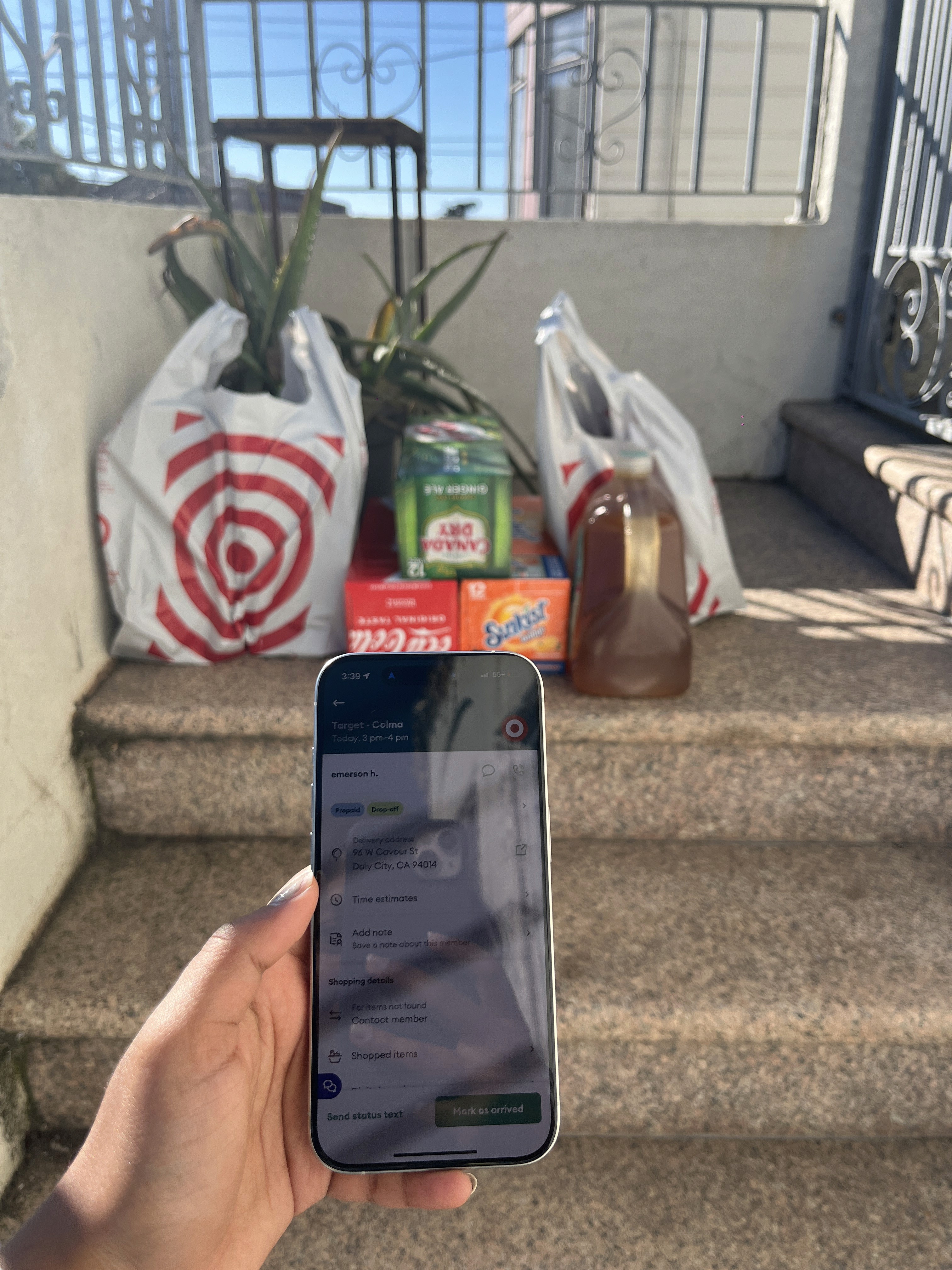
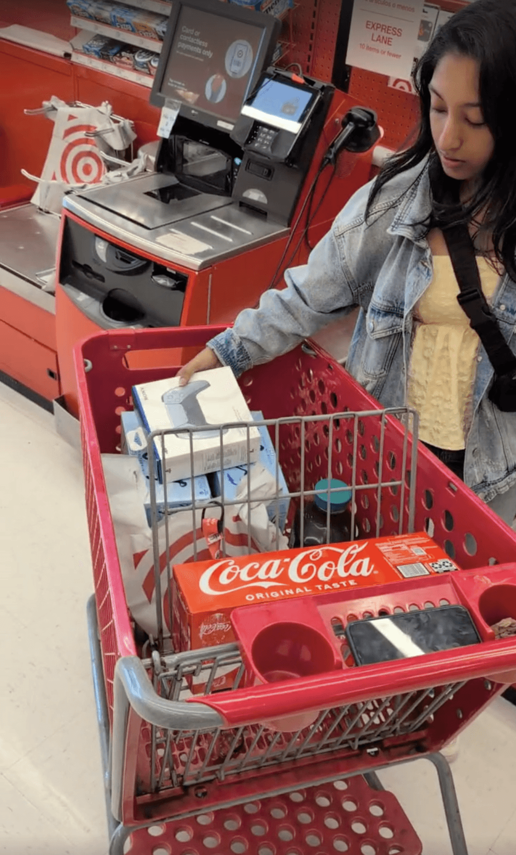
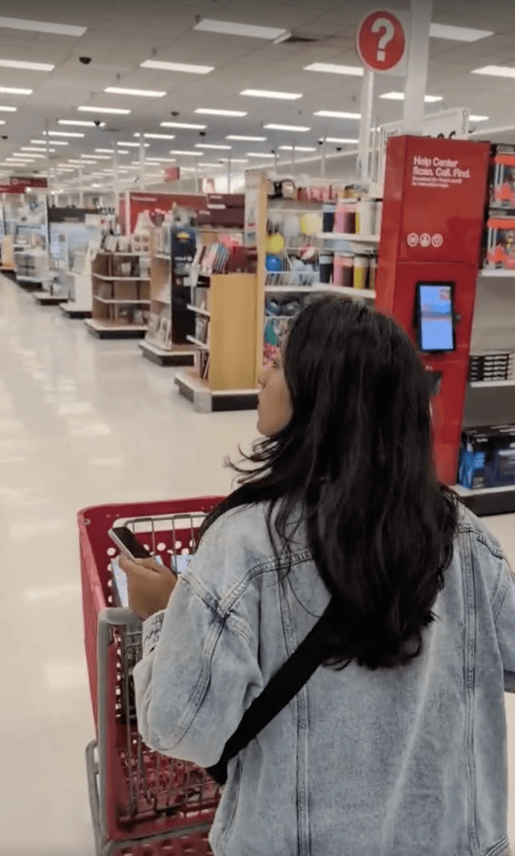
I was a Shipt Shopper for a day
Spending a day as a shopper gave me firsthand insight into the challenges shoppers face, such as order claiming delays and app inefficiencies. Testing my designs in real-world scenario helped me refine solutions that better aligned with shopper needs and identifying areas for improvement when navigating the app under time pressure.

LEARNINGS
Design for familiarity
Mental Model
Cognitive recognition
While I explored reimagining badges, user testing revealed the cognitive reliance on pill-shape as anchors for critical information. This established mental model made the familiar format indispensable for quick recognition and usability.
Involve users early
User Environement
Cognitive recognition
Testing in users' real environments proved critical to understanding the nuances of their experiences. Observing shoppers interact with order cards during their shopping workflow revealed practical challenges and behaviors giving me opportunity to create solutions that seamlessly integrated into their natural shopping journey.


