
Elevating Homepage
Personalization and Improved Product Discovery

My Role
End-to-end visual design, prototypes, high-fidelity mockups

Team
1 Product Designer (Me)
1 Product Manager
2 Brand Content Strategists
2 Data Engineers

Impact
2.8 times increase in user engagement amongst 15M+ registered users
OBJECTIVE
Optimize Homepage for Impact
Challenge from Business
A significant decrease in user engagement with brands on the homepage presents a pressing challenge to business performance and overall impact.
User Retention
Brand Engangement
Scalability
Challenge from Users
Users struggle to navigate the platform's lengthy homepage, which lacks personalized recommendations, resulting in a limited discovery of brands.
Personalisation
Lengthy Page
Navigation
PROBLEM
Alarming drop-off rate on Homepage
I conducted a usability audit of Nykaa's old homepage design. Through scroll performance analysis, I discovered a drastic drop-off rate after the first fold, indicating a need to optimize content hierarchy and engagement beyond the first viewport.
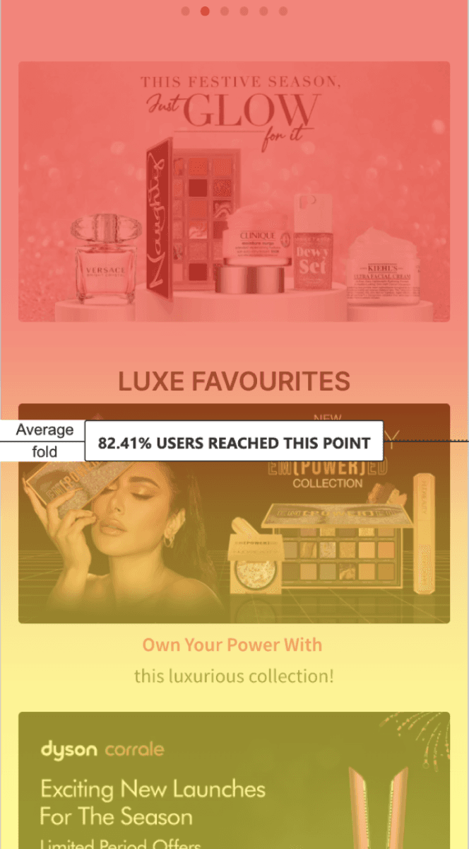

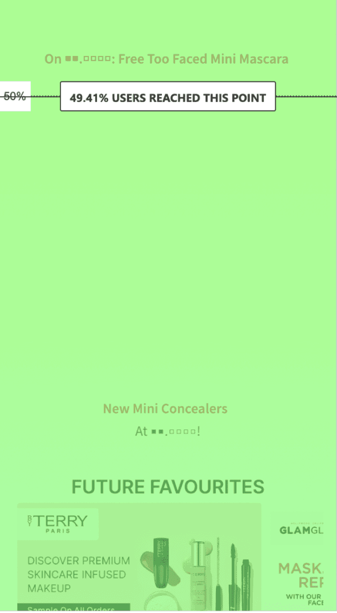
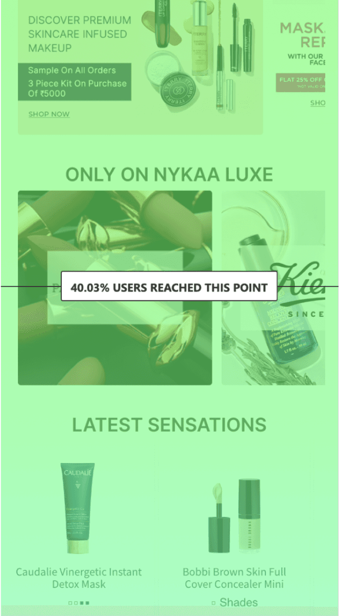
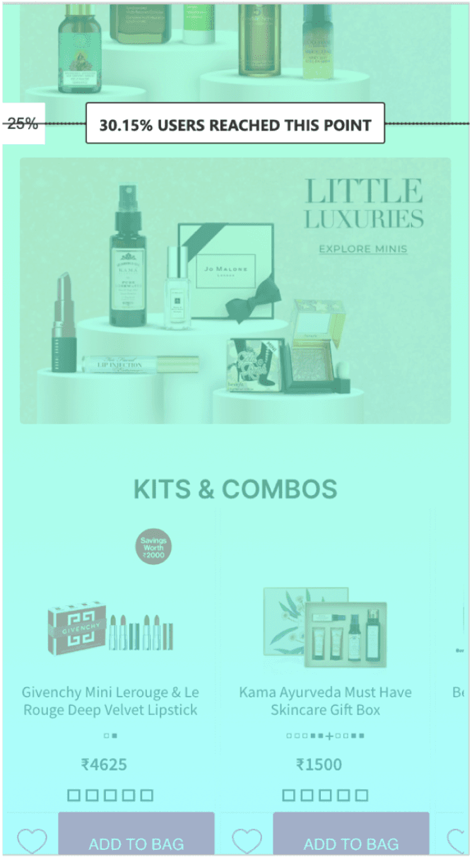
17.59%

25.80%
50.59%
59.97%
69.85%


After the first 3 folds of the Homepage, there was almost no traffic and the
clicks per section declined.
SOLUTION
Final Design
Discovery of Brands
Engangement
Purchase
In this case study, I have explored in detail how I enhanced the user journey from discovery to purchase, emphasizing improved visibility of brand sections, to enhance overall business outcomes.

Low Impact Scroll
Banners failed to resonate with users due to excessive text conflicting with the visuals
1
Sliding Navigation
Banners failed to resonate with users due to excessive text conflicting with the visuals
1
Cart Conversion
A quick entry point to add products to cart directly based on their search / wishlist history.
2
Visual Imbalance
The visuals exhibited inconsistent color schemes. Text hierarchy and alignment lacked cohesiveness.
3
Navigation lacks intent
Though far down scroll, users were engaging with categories.
1
Lacks excitement
USP sections of Nykaa are unnoticed. The page lacks premium aesthetic overall.
6
Poor discovery
Brands and categories are displayed similarly, they lack distinct identity or hierarchy.
5
Repetition
Many sections appear repetitive, featuring reused widgets and lacking creative elements.
3
UI Consistency
The page adhered to a consistent color theme season wise and uniform typograpghy.
3
Social proofing
Linked real time social media content to aid in narrating the brand’s story.
4
Personalization
Monetized focus section to promote newly launched products exclusively for premium members.
5
Giving a glimpse
Designed an auto carousel with slight indication about the following banner to create curiosity
6
Store locator
Bridged the gap between Nykaa online presence and real-world store outlets.
7
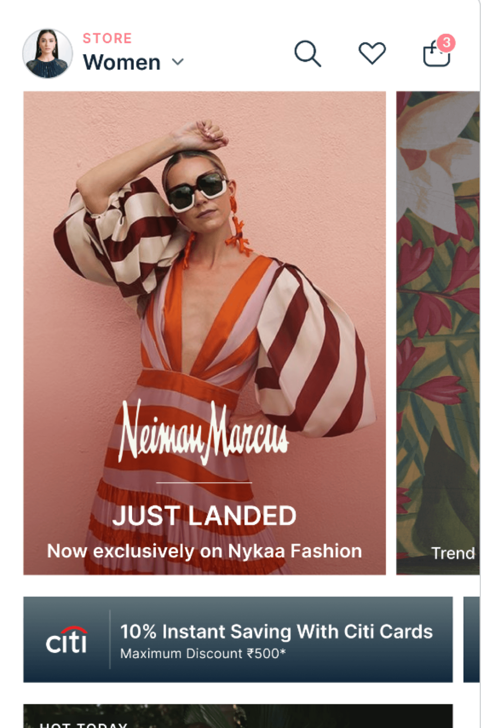
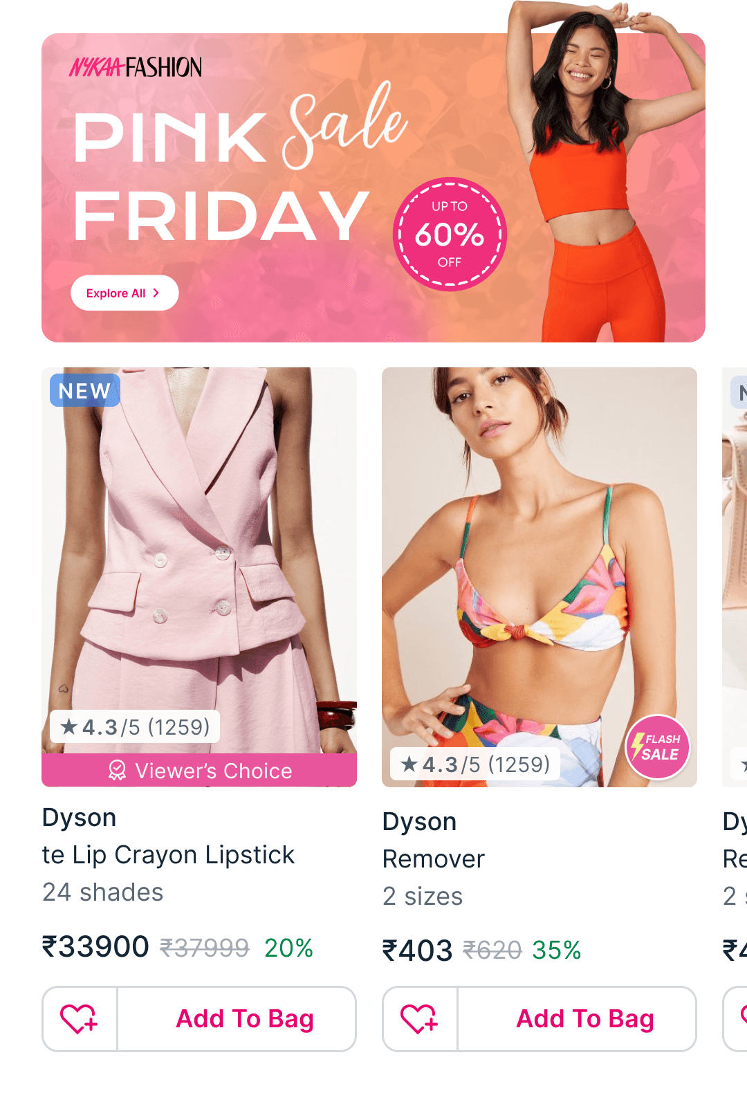
Before
New Homepage

PERSONALIZATION
Shop from Social Media


USER RESEARCH
Defining our User group
86% Women
Age : 20yrs - 45yrs
Fashion Forward


"I trust Nykaa for its variety and quality,
but I wish it gave me more personalized product suggestions."
Riya Jhaveri - Nykaa customer for 5 years
DEFINE
Redesign Objectives

#1
Navigation
9/10 users felt lost in the homepage.
#2
Personalization
Users seek personalized recommendations.

#3
Brand Visibility
Monetized brand sections lacked visibility.
#4
Scalability
Introducing new sections without altering the layout.
#1 SOLUTION
Product Visibility
Old Design
New Design
Banners featuring real-time models had a significant impact
Consumed excessive scroll length
Concise banner showcasing model and category
Users can directly add products to cart
Optimizing for Desktop app
Impact in first fold

Intent Driven Navigation
Personalization
Cart Conversion
#2 SOLUTION
Brand Discovery

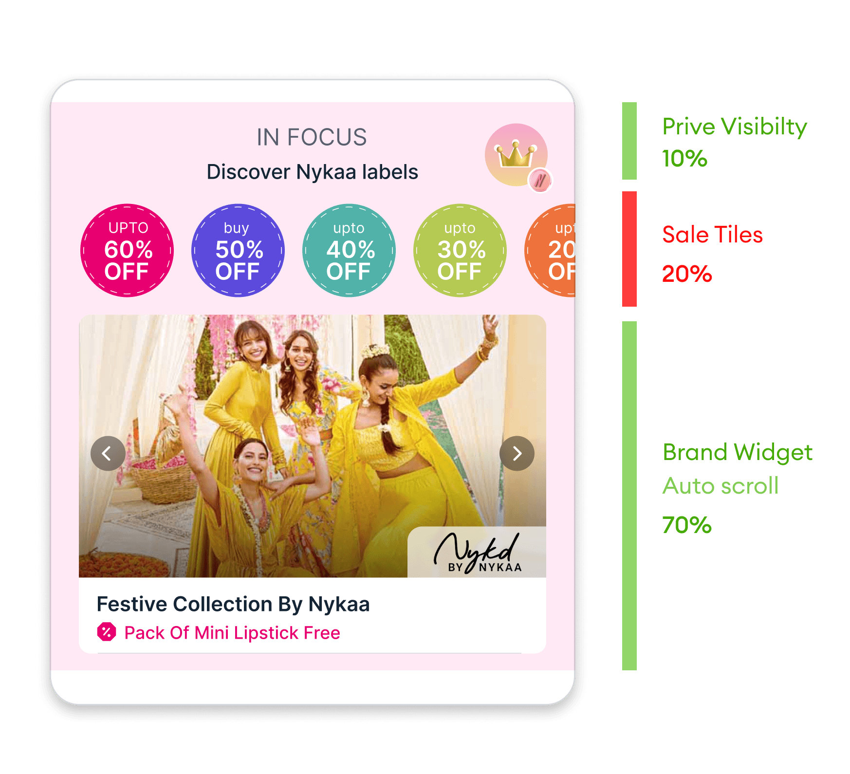
Discover new brands and curated offers
Banners with auto-scroll performed well. creating curiosity for users.
Users discovered more brands than before.
Users clicked on brand tiles more.
Users had a strong preference for an intent driven shopping experience.
Brands in focus
Enhanced brand discovery
Personalized suggestions
Scalability
#3 SOLUTION
Optimising Navigation


New Design

Old Design
Despite its second-fold placement, this section garnered the highest click rates.
Consumed excessive scroll length
Dynamic pills to ease navigation and incorporate variability
Optimized vertical scroll to showcase more categories and brands
DESIGN SYSTEM
Visual Mindmapping
Visual mind mapping enhances memory retention. Using circles to represent categories and rectangles for products, it provides an structured and visually pleasing framework.
Category Tile

Watches
Product Card
BRAND NAME

Daniel Wellington
Banner Guidelines
73% Visible Creative Space
Description Area
Promoted
Promoted


Upto 70% Off
Festive collections by Nykaa
360x240px
3:2 Ratio


Illustrated Icons
Reward Points for every order
Exclusive Surprise Offers & Coupons
Earn 1.5x Points in your Birthday Month
Access Beauty Bars
& Masterclass
OUTCOME
Impact Numbers
Average time spent on the Homepage
Before
After
12 Secs
1.1%
Nil
28 Secs
12%
3.9%
Conversion of products from Homepage to Cart
Daily active users who have installed the app
2.8
Times Increase
Overall User Engagement on the Homepage